Luckily for all of us, the VHS (yes, VHS) of Sleeping Beauty I own happens to come with a special after-the-movie feature about the making of the film, complete with commentary about the film’s stunning visual art. Upon its release in 1959, Sleeping Beauty was the film Disney Studios had taken the longest time in animating–six years. The film is only one hour and sixteen minutes long. So why did animation take so long?
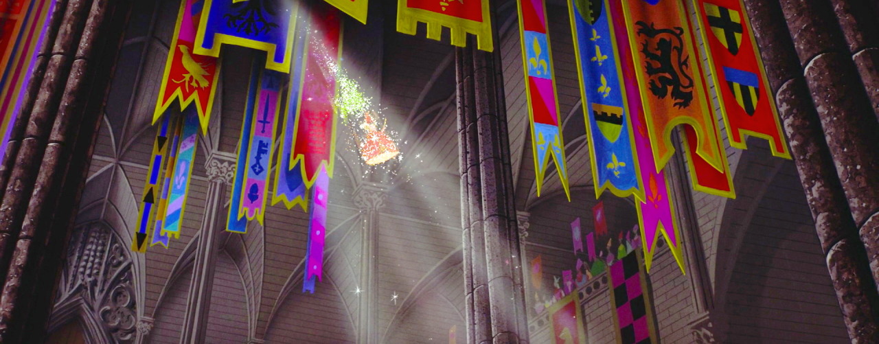
In the feature, the animators discussed how both they and Walt Disney wanted the film to feel markedly different than Snow White and Cinderella, the two princess films preceding Sleeping Beauty. So they conducted extensive research into medieval paintings, manuscripts, and architecture to make Sleeping Beauty feel much more medieval than either of the previous princess films. The animators say that the film’s focus was decidedly pre-Renaissance–mostly Gothic, which is evident when you look at the architecture within the castle. Look at those vaulted arches!
By looking at both medieval European and Persian illuminated manuscripts, the animators realized a similarity between some of the modern art of the 1950’s and medieval art–many of the artists make use of clean lines and the juxtaposition of horizontals and verticals rather than focusing on creating a perfect vanishing point (perspective).
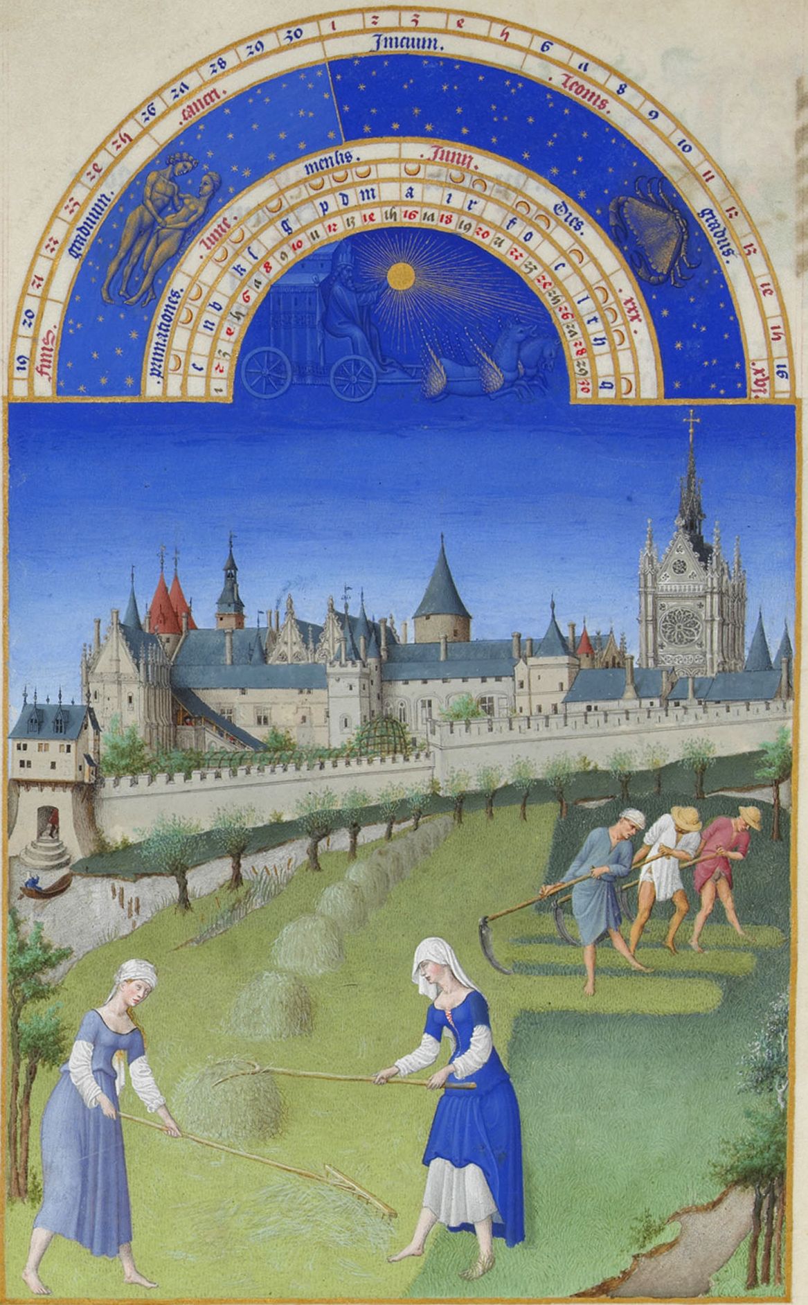
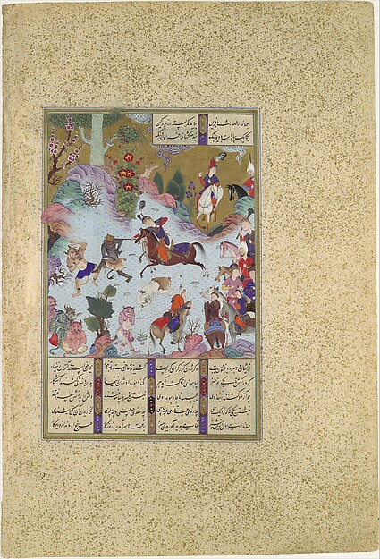
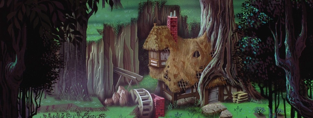
And nowhere is this better incorporated than in the forest scenes in Sleeping Beauty, which animators then and now credit as containing some of the best artwork in all Disney films. And if that isn’t enough, animators stated that they worked to make sure each landscape could match with the characters.

But look at the sumptuous detail. Where is that coming from? Well, according to the feature, animators looked at pre-Renaissance northern European art as well and incorporated the extreme attention-to-detail found there. Animators listed pieces like van Eyck’s The Ghent Altarpiece and the Hunt of the Unicorn tapestries as influences to their art in Sleeping Beauty. You can see the fine details in both pieces and how that translates to both landscape and character in Sleeping Beauty. The artwork is so rich that the film was shot in 70mm film, a bigger size than used in any other Disney film, to show the scope of the art.
,%201432,%2011.5'%20x%2014.5'.jpg)
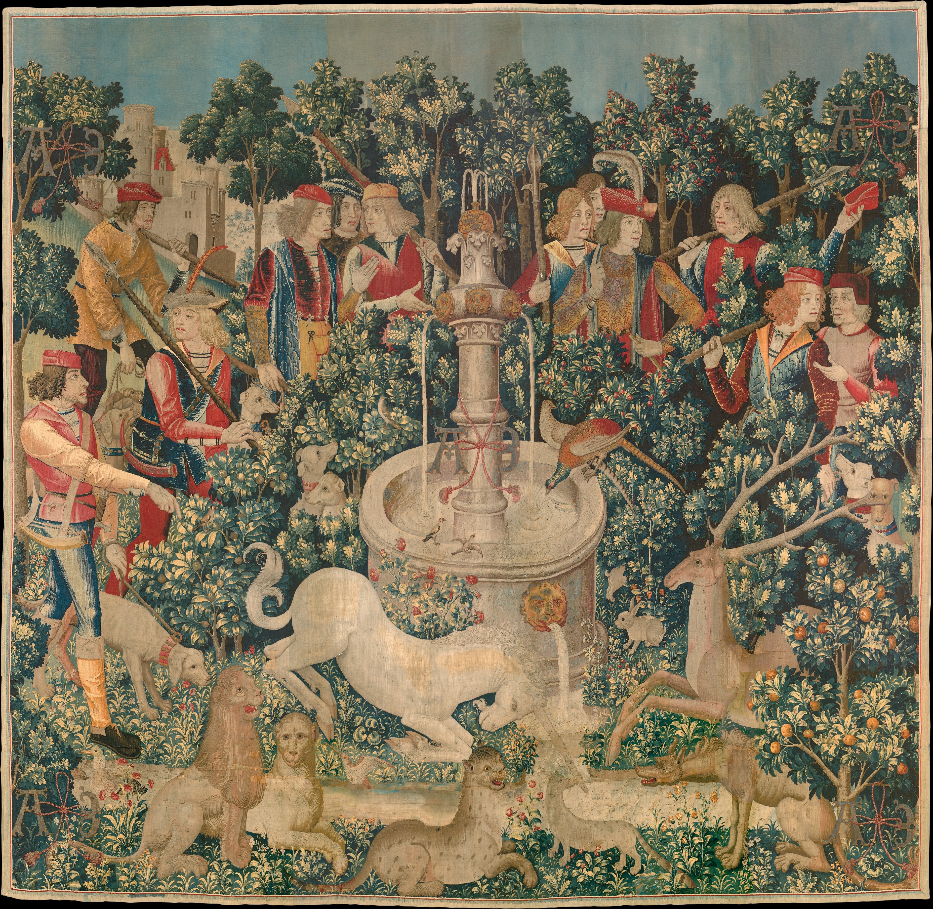
So the next time you watch Disney’s Sleeping Beauty, take note of the use of horizontal and vertical lines and extreme attention-to-detail. Because it’s actually pretty stunning if you look at each frame. I mean, just look at these shots. Ah-mazing.


Be sure to check out The Art of Walt Disney’s Sleeping Beauty on Tumblr for more awesome artwork from Disney’s Sleeping Beauty!


